
Overview
Living Reviews in Solar Physics is a platinum open-access journal that publishes invited reviews of research in all areas of solar and heliospheric physics.
- Unique in maintaining a suite of high-quality reviews that are regularly updated by the authors.
- Founded by the Max Planck Institute for Solar System Research (MPS) in 2004.
- Living Reviews® is a registered trademark of Springer International Publishing AG.
- Editor-in-Chief
-
- S.K. Solanki
- Impact factor
- 20.9 (2022)
- 5 year impact factor
- 23.8 (2022)
- Submission to first decision (median)
- 12 days
- Downloads
- 313,791 (2023)
Societies and partnerships
Latest articles
Journal updates
-
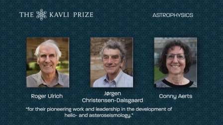
Congratulations Kavli Prize Winners 2022!
Jørgen Christensen-Dalsgaard, long-time Editor of Living Reviews in Solar Physics shares Kavli Prize in astrophysics
-
Congratulations Hale & Harvey Prize Winners 2022!
Sami Solanki, Editor-in-Chief of Living Reviews in Solar Physics, is awarded the 2022 George Ellery Hale Prize

Journal information
- Electronic ISSN
- 1614-4961
- Abstracted and indexed in
-
- Astrophysics Data System (ADS)
- Baidu
- CLOCKSS
- CNKI
- CNPIEC
- Chinese Academy of Sciences (CAS) - GoOA
- Current Contents/Physical, Chemical and Earth Sciences
- DOAJ
- Dimensions
- EBSCO
- Gale
- Google Scholar
- INIS Atomindex
- INSPEC
- Naver
- OCLC WorldCat Discovery Service
- Portico
- ProQuest
- SCImago
- SCOPUS
- Science Citation Index Expanded (SCIE)
- TD Net Discovery Service
- UGC-CARE List (India)
- Wanfang
- Copyright information